
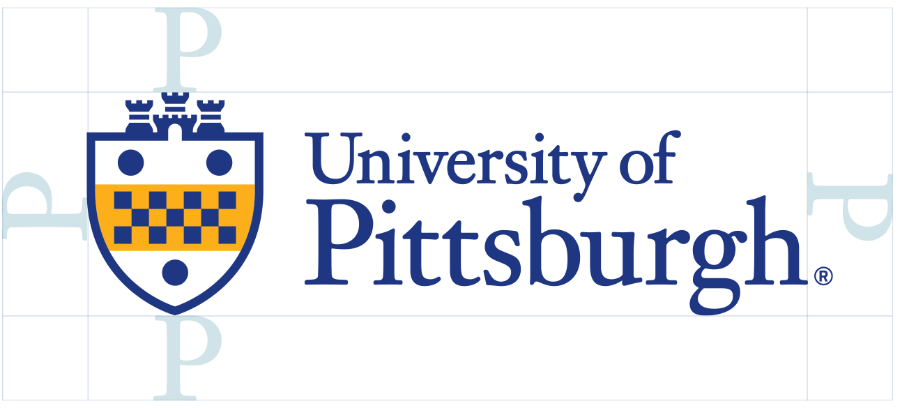
The University of Pittsburgh’s Institutional Mark is composed of the shield and signature. It embodies the heritage and prestige of our institution. This logo serves as the cornerstone of our visual identity, representing our commitment to excellence and our proud history. Consistent and correct usage of the Institutional Mark is essential in maintaining the integrity and recognition of the Pitt brand.

Full & One Color Usage
It’s important to have a versatile logo system that can accommodate a range of applications. To account for this, a number of color options have been created. These are the only approved versions of the logo.
Whenever possible, default to the full color versions. Pantone, CMYK, and RGB versions exist, so use the one that’s most appropriate for the application.


Clear Space & Size
We ensure that other elements don’t compete with the Institutional Mark by maintaining a minimum amount of space around the perimeter, measured with the height of the P in Pittsburgh. This applies to all versions of the mark except in cases of subbranding with schools, centers, institutes and departments.
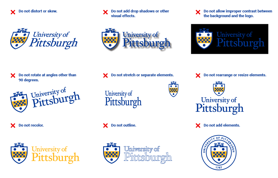
Incorrect Usage
To ensure consistent use of the logo, here are some practices to avoid:
- Don't skew or bend the logo in any way.
- Don't use drop shadows or other visual effects.
- Don't use the logo on a background with insufficient contrast.
- Don't use any colors other than those specified on this site.
- Don't outline the logo.
Unit Lockup Formats: Our brand guidelines offer different logo lockups for flexibility and consistency, including horizontal, stacked, and vertical formats and shorthand.
Regional Campus Marks: When representing a University of Pittsburgh regional campus, the Institutional Marks should be visually consistent.
